
EDUTRANS
Branding

Web and Marketing Design

Graphic Design
EDUTRANS
Branding

Web and Marketing Design

Graphic Design
EDUTRANS
Branding

Web and Marketing Design

Graphic Design
About
About
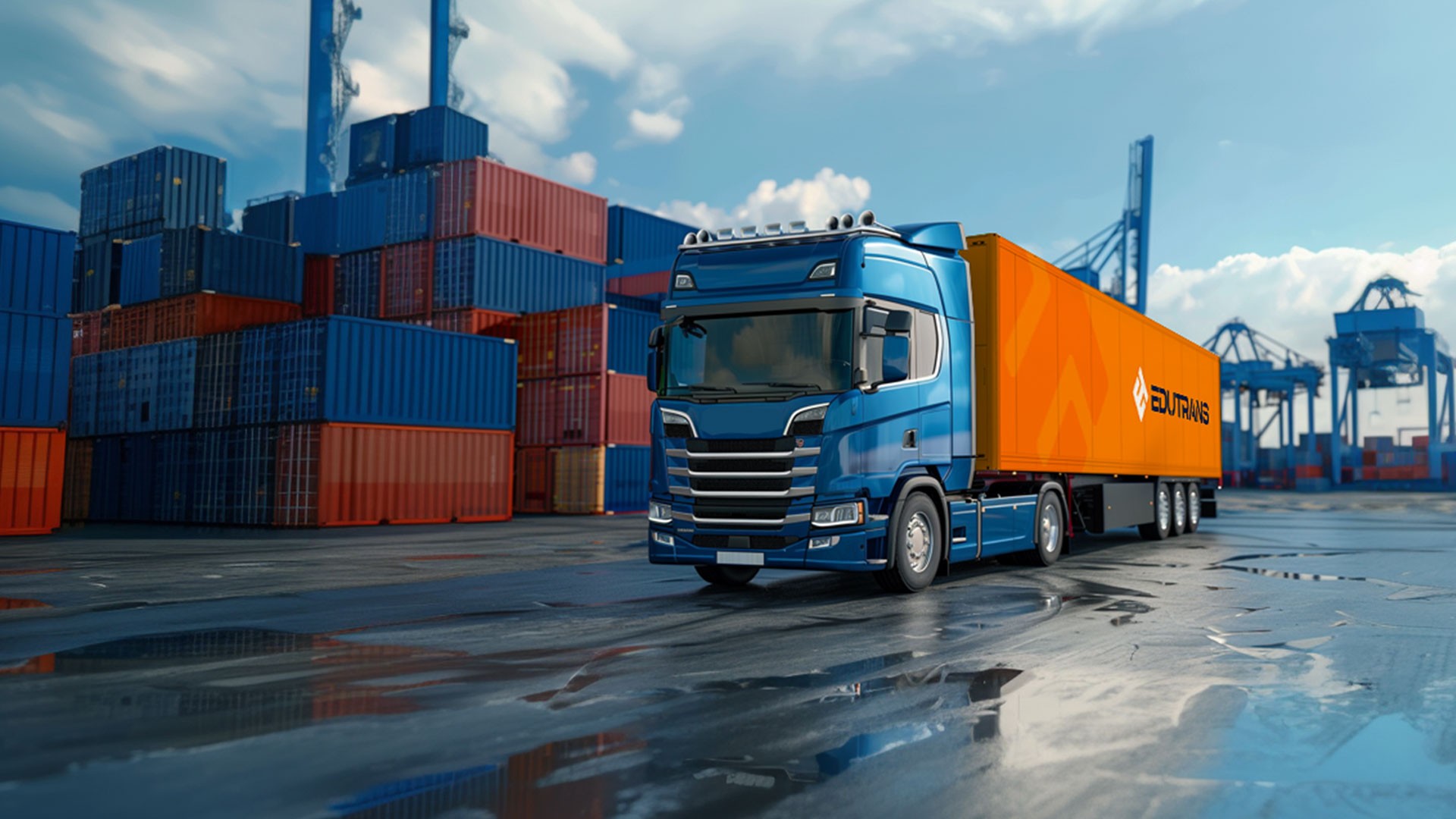
EduTrans is a logistics company based in Estonia that provides customized freight solutions across Europe. Its primary focus is on efficiency, reliability, and customer satisfaction. It offers full truckload (FTL), less-than-truckload (LTL), and specialized cargo transport services.

Task
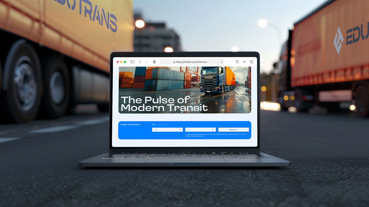
Create a modern and fresh brand identity that reflects the values of efficiency, reliability, and customer satisfaction. Additionally, develop a website that embodies these values and provides a user-friendly experience. The goal was to develop a cohesive visual style that could be applied across all media, distinguishing the company in the logistics market.

Preparation
The initial phase of the project involved analyzing the logistics industry, key competitors, and defining the core values of the EduTrans brand. During the analysis, it was identified that many competitors relied on conservative branding approaches, with minimal emphasis on innovation, environmental responsibility, or a personalized client experience.
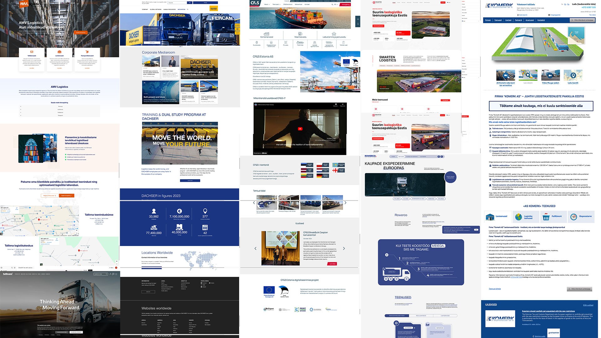

As a result, it was decided to focus on creating a bright, modern, and memorable brand that highlights innovation, sustainability, a personalized approach, and client convenience. This approach was intended to help the brand stand out in the market and appeal to clients seeking progressive logistics solutions. These elements formed the foundation of the project's vision and determined the visual codes that would emphasize its advantages.

Logo
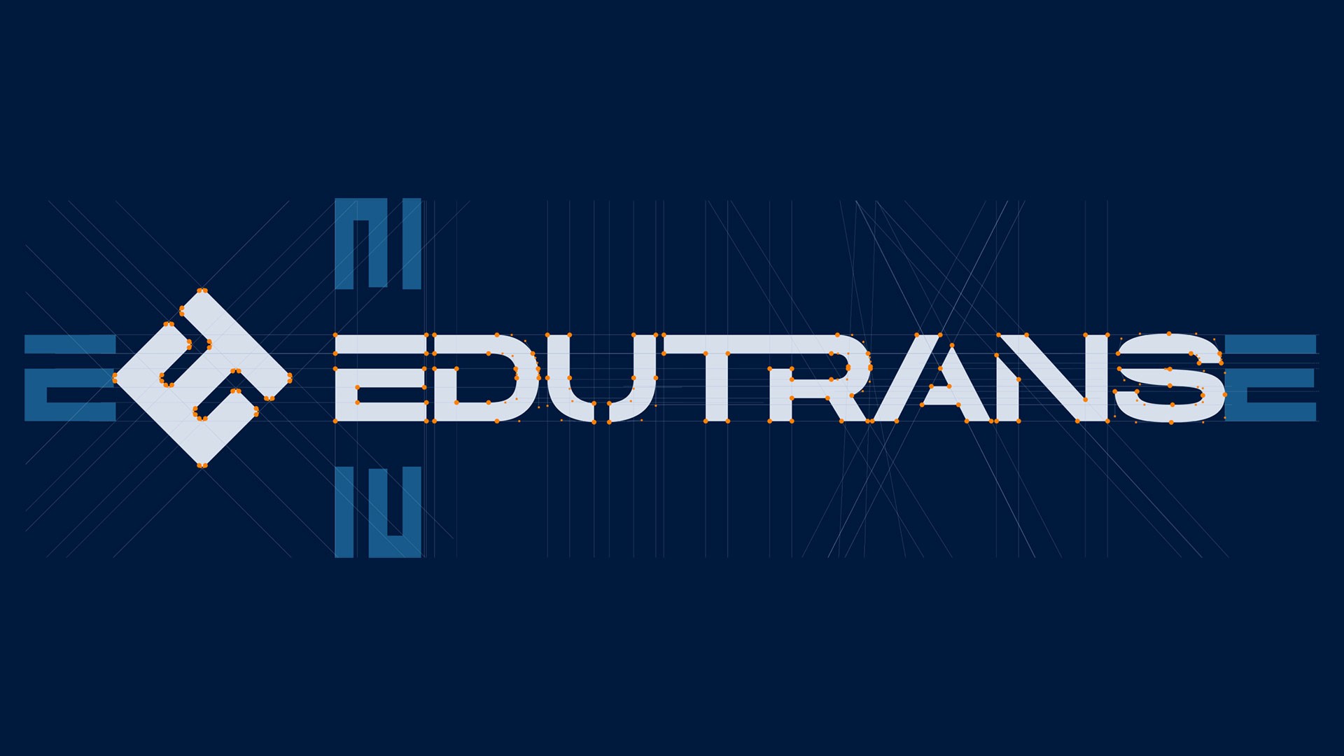
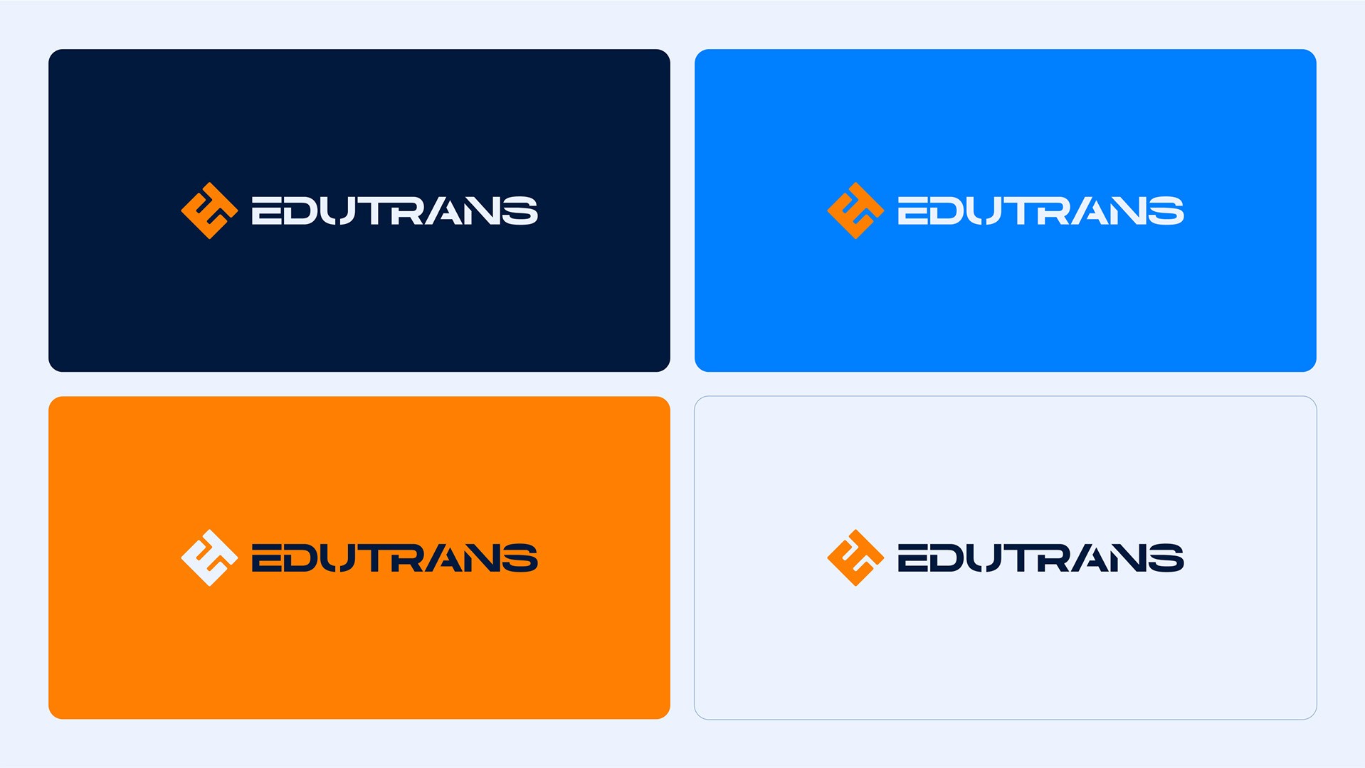
The logo represents a modern and minimalist design, combining a symbol related to transportation routes and the company name. The design features a geometric approach, simplicity, and readability.




Color Palette
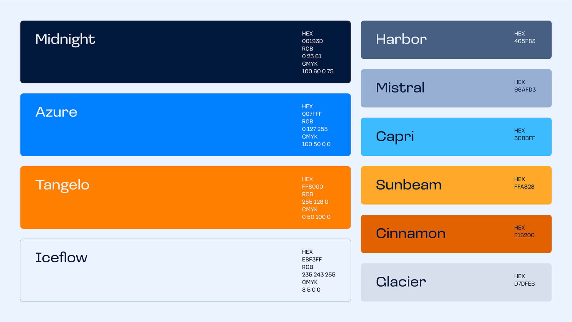
A vibrant and contrasting color palette was developed to highlight the brand's reliability and energy.

Typography
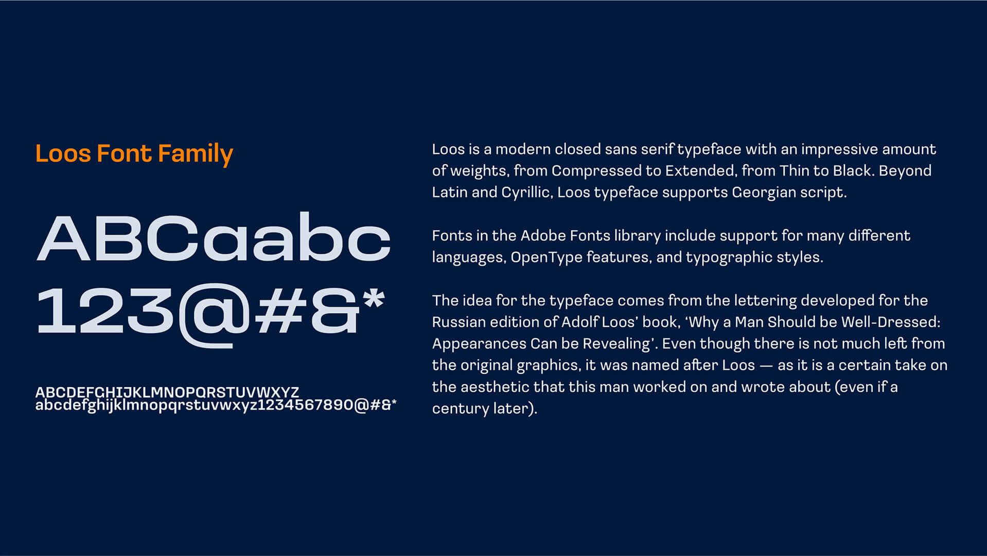
The typeface chosen is modern and easy to read, with a focus on simplicity and a premium look. The main typeface is Loos, a modern closed sans serif that pairs well with the color palette, providing a professional and cohesive appearance to all brand assets.

Identity
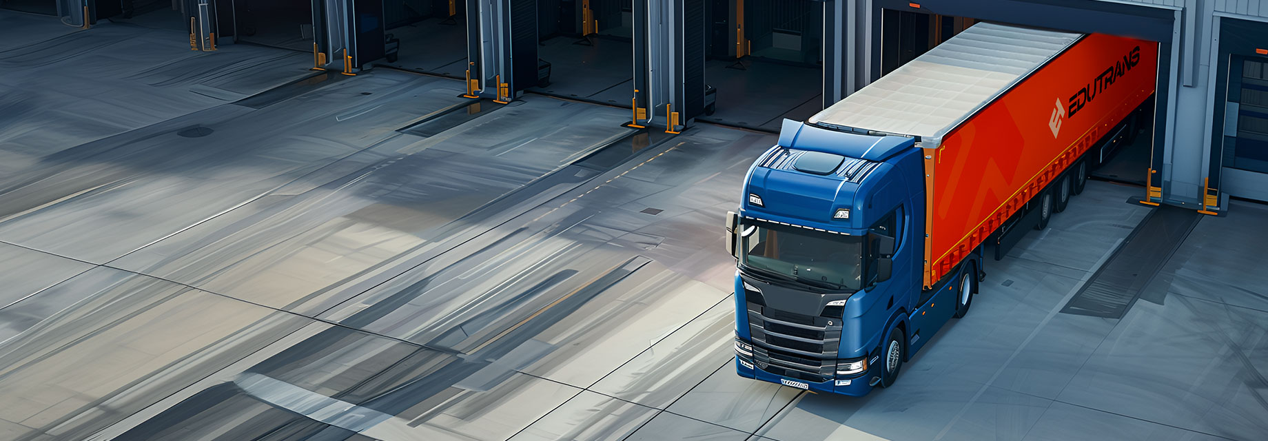
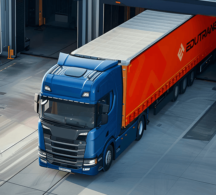
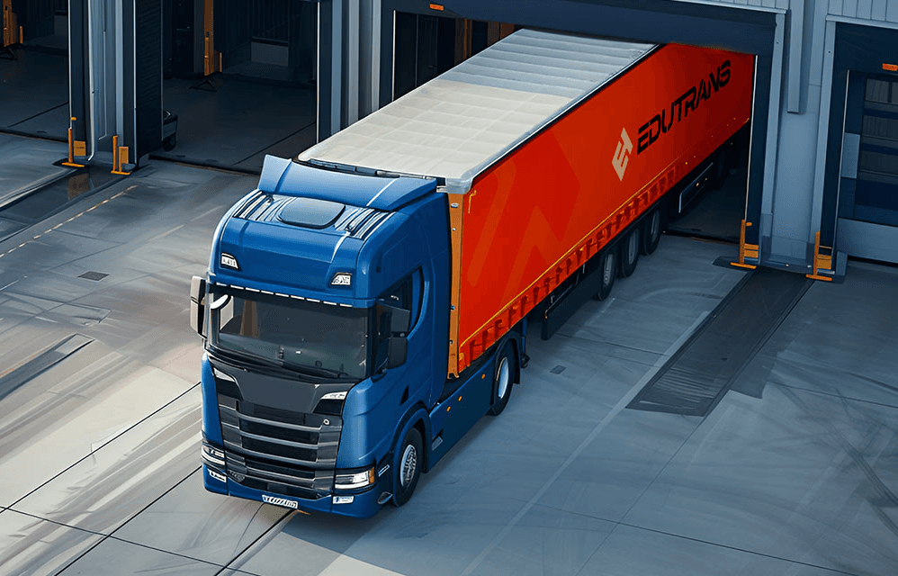
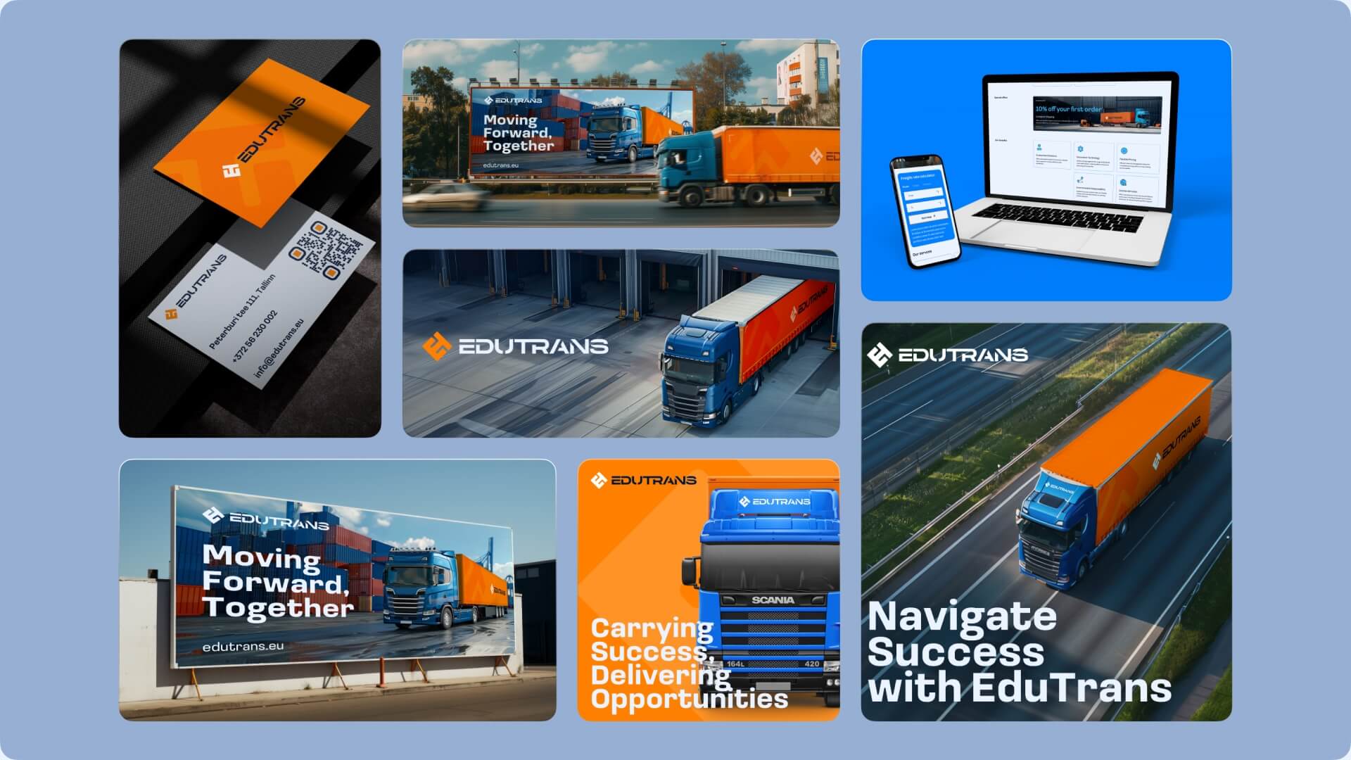
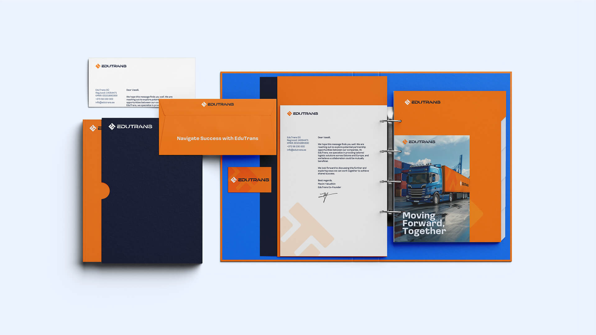
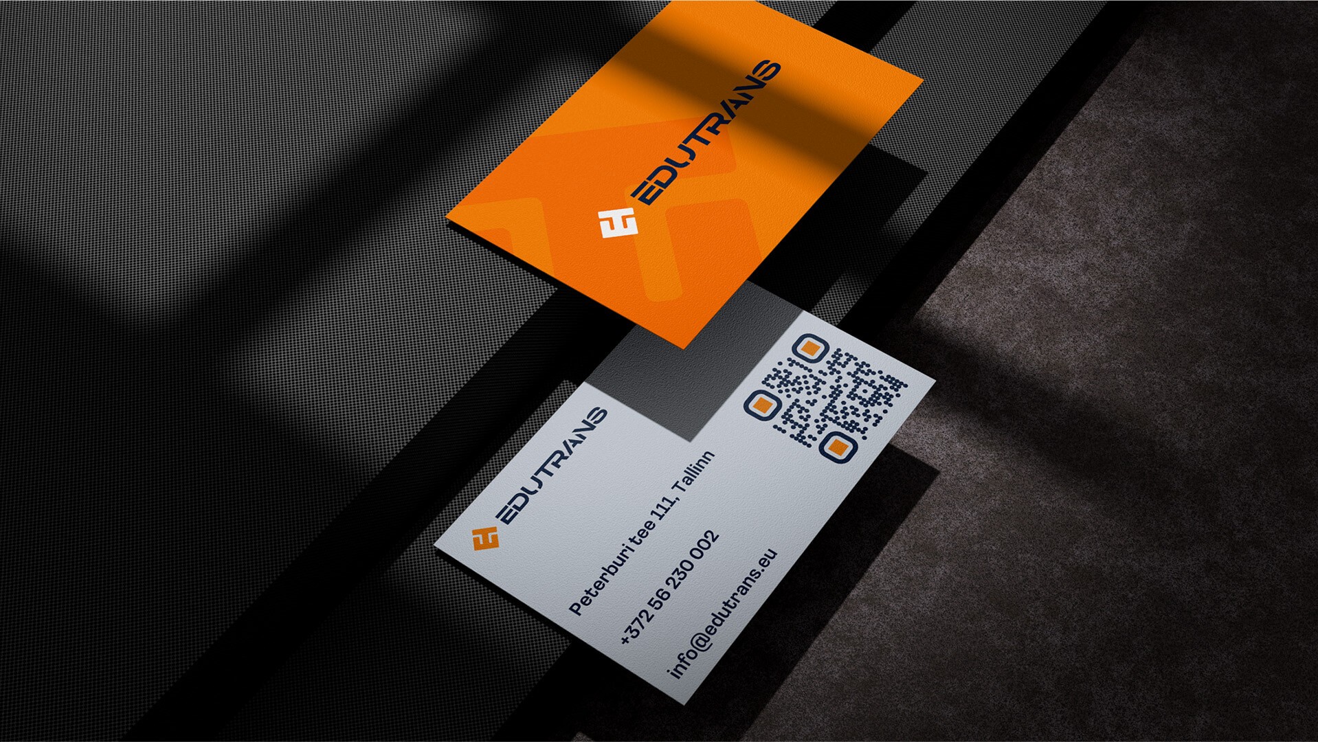
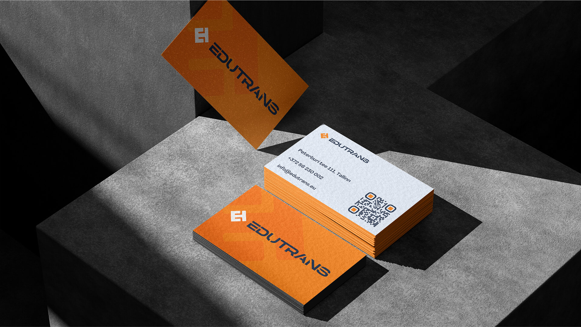
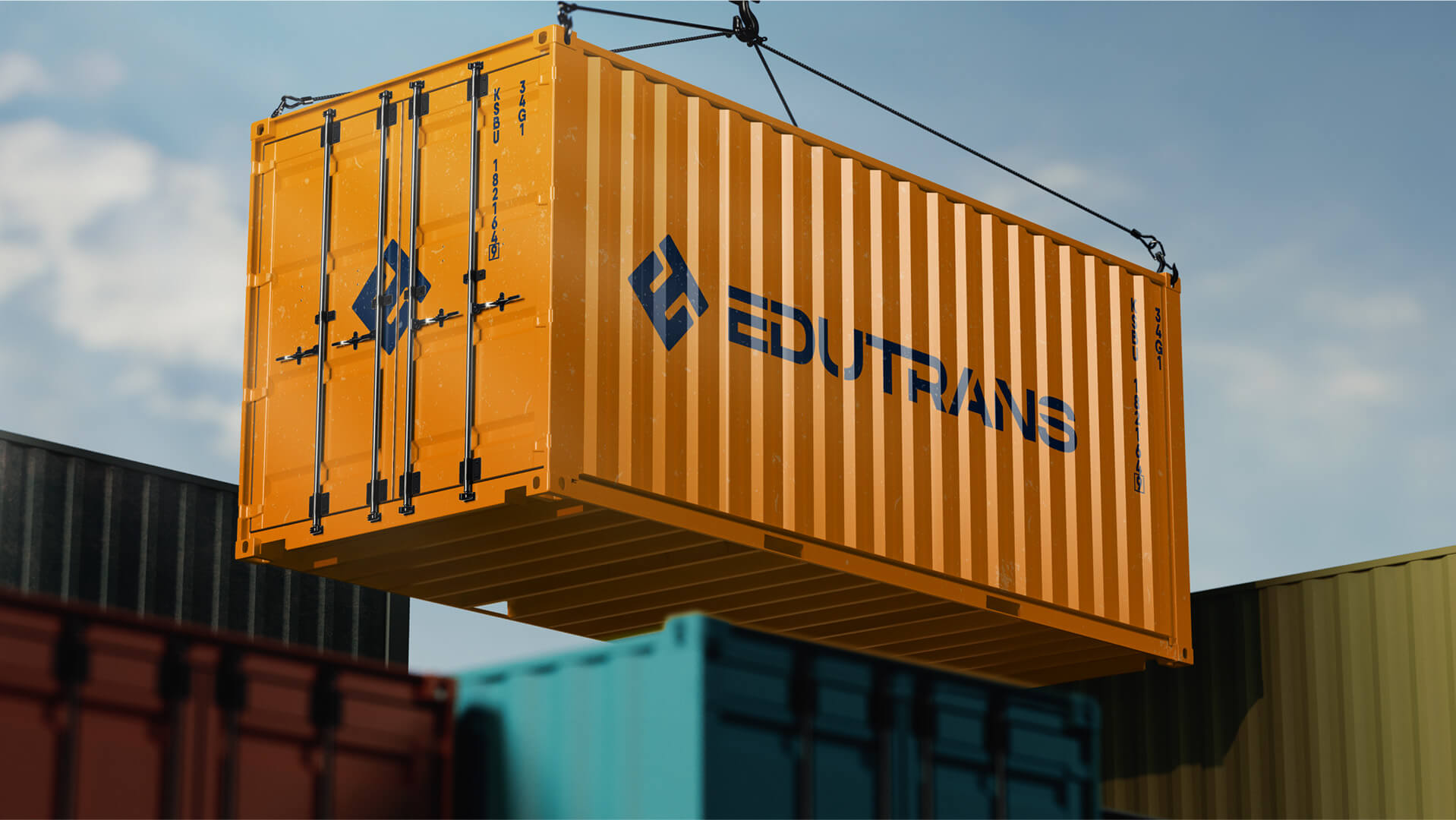
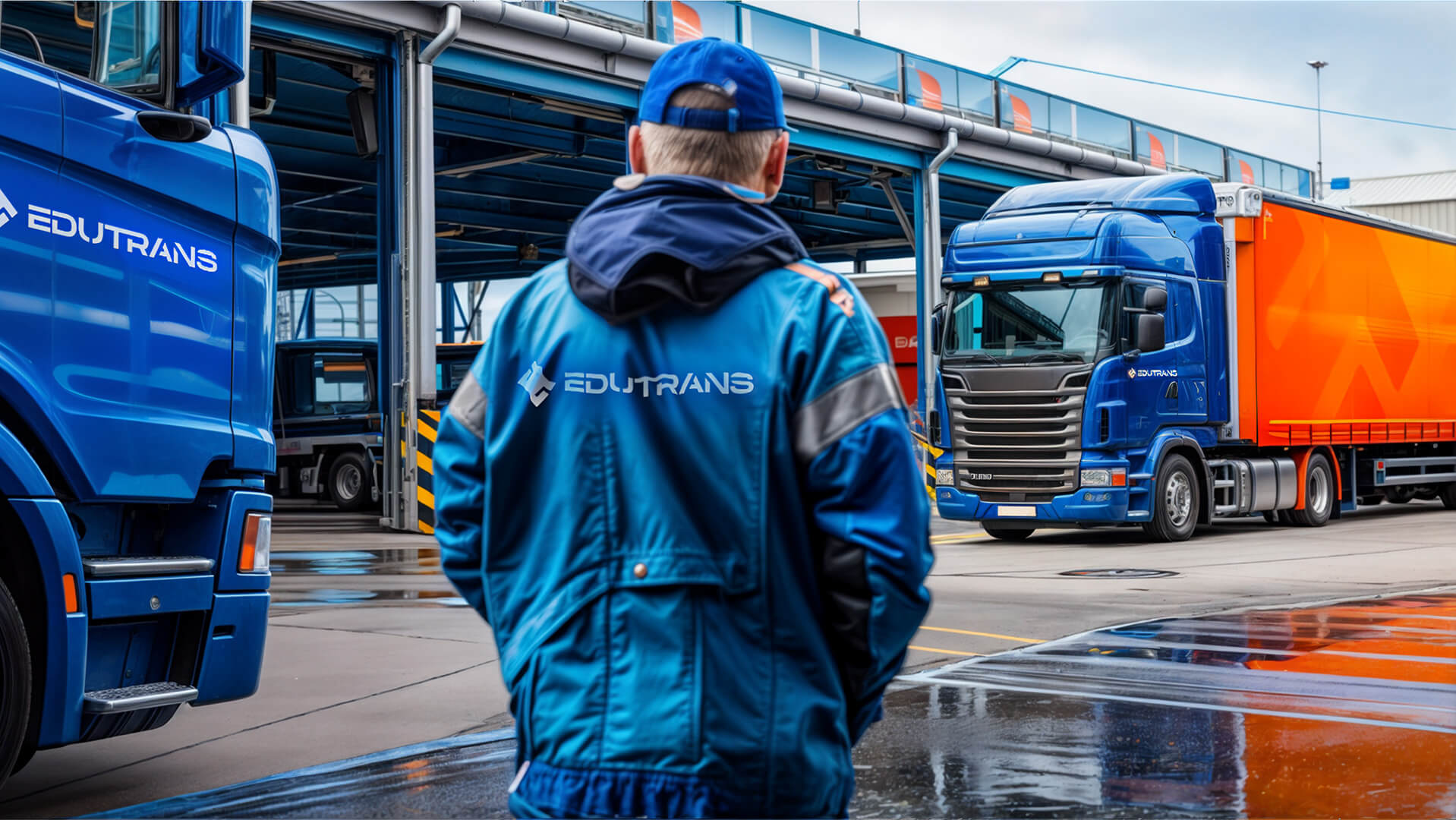
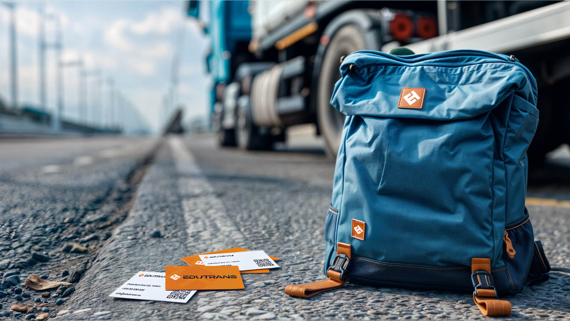
The identity includes the development of business cards, paper folders, brochures, envelopes, other office materials, as well as vehicle designs, driver uniforms, and merchandise, all executed in a consistent style. Each element undergoes strict quality control to ensure a unified visual style.













Social Media and Outdoor
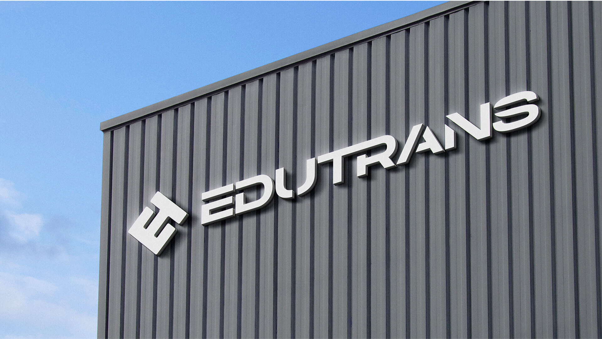
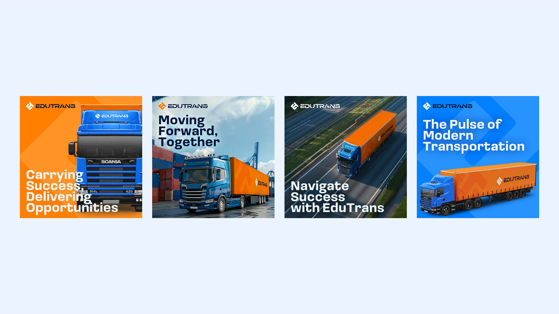
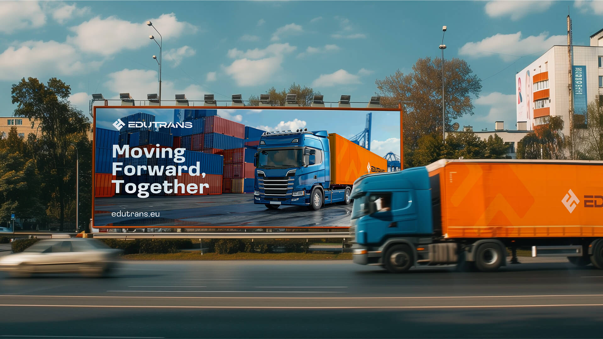
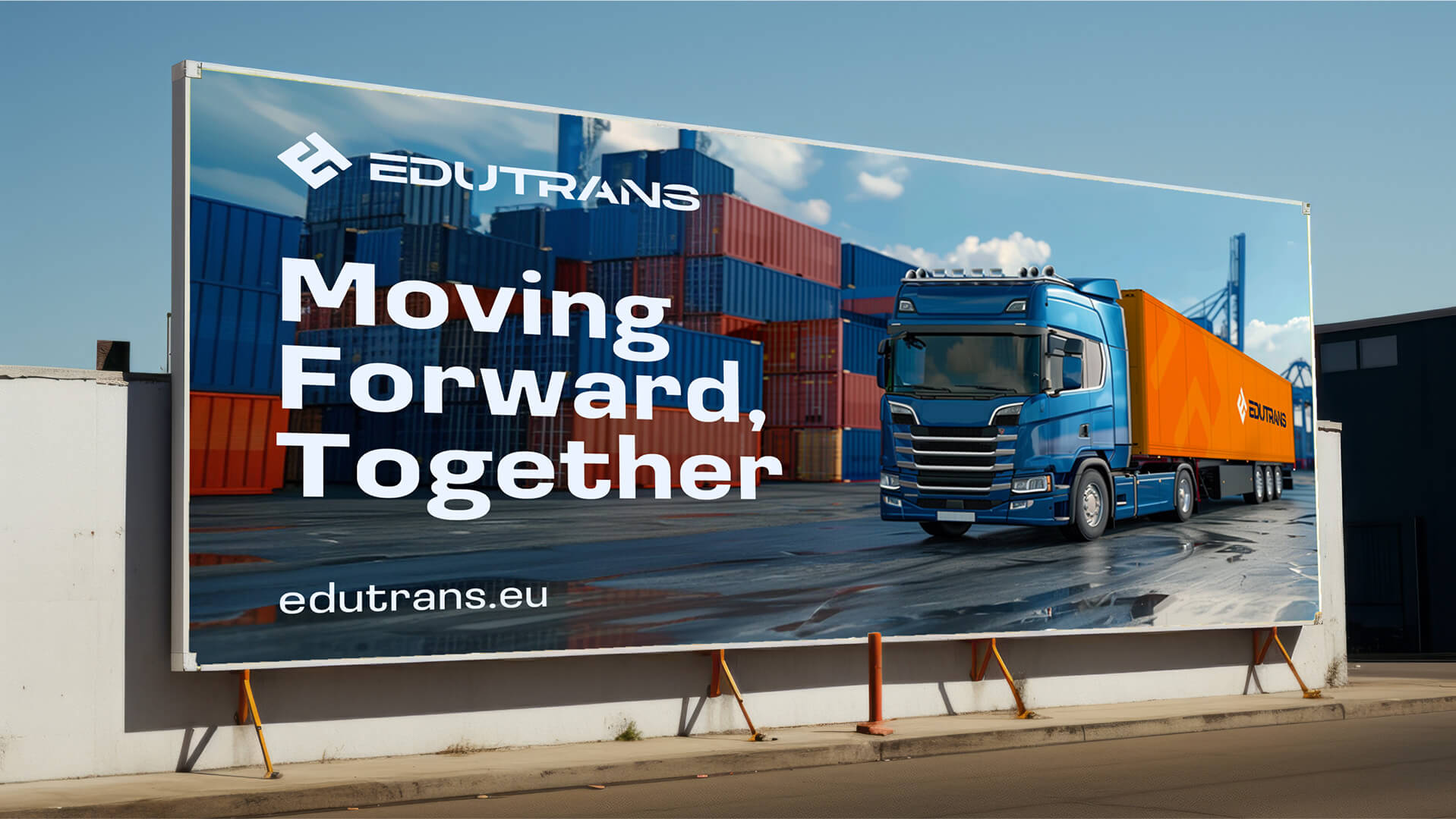
To promote the brand, mockups were created for social media, highlighting brand messages, unique offers, and supporting sales. Visually, they emphasize EduTrans' achievements, brand attributes, and visual consistency





Website
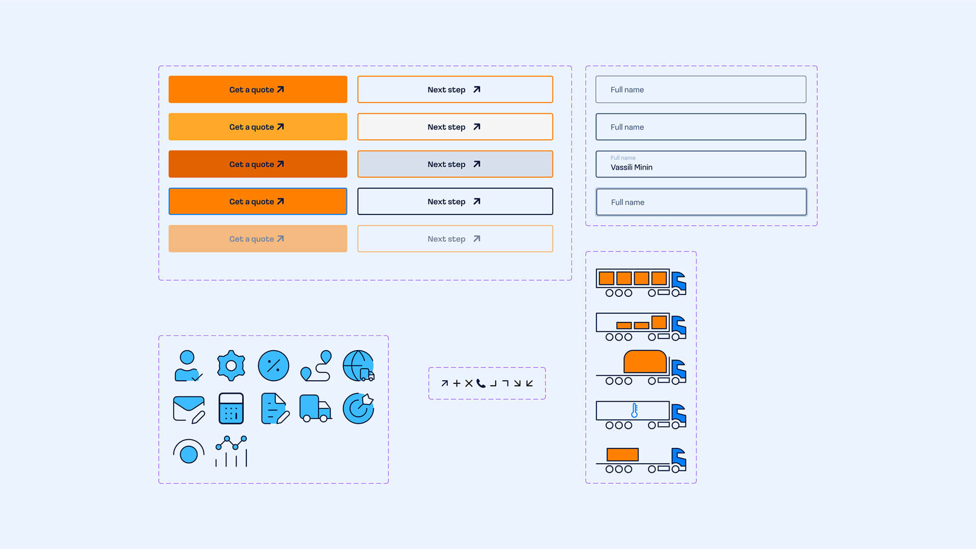
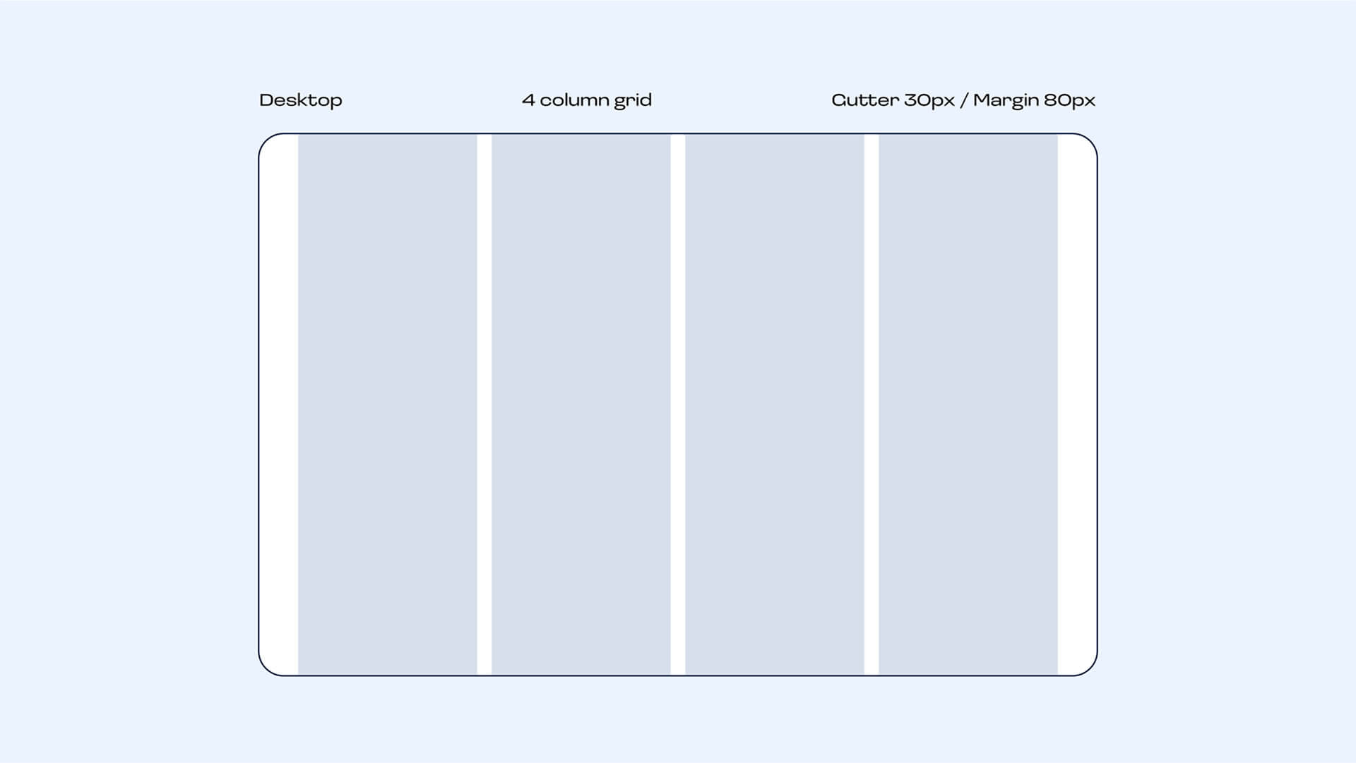
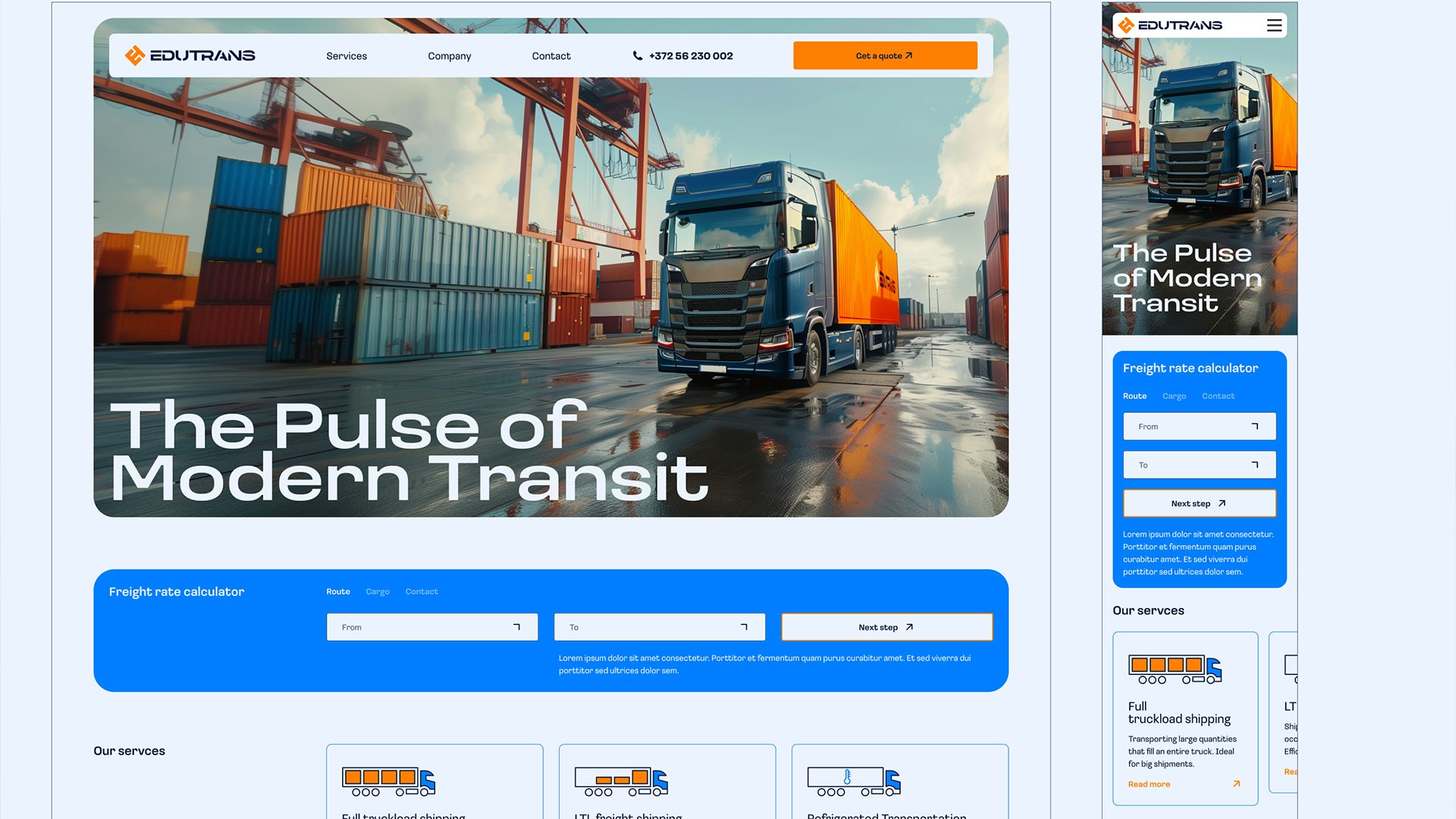
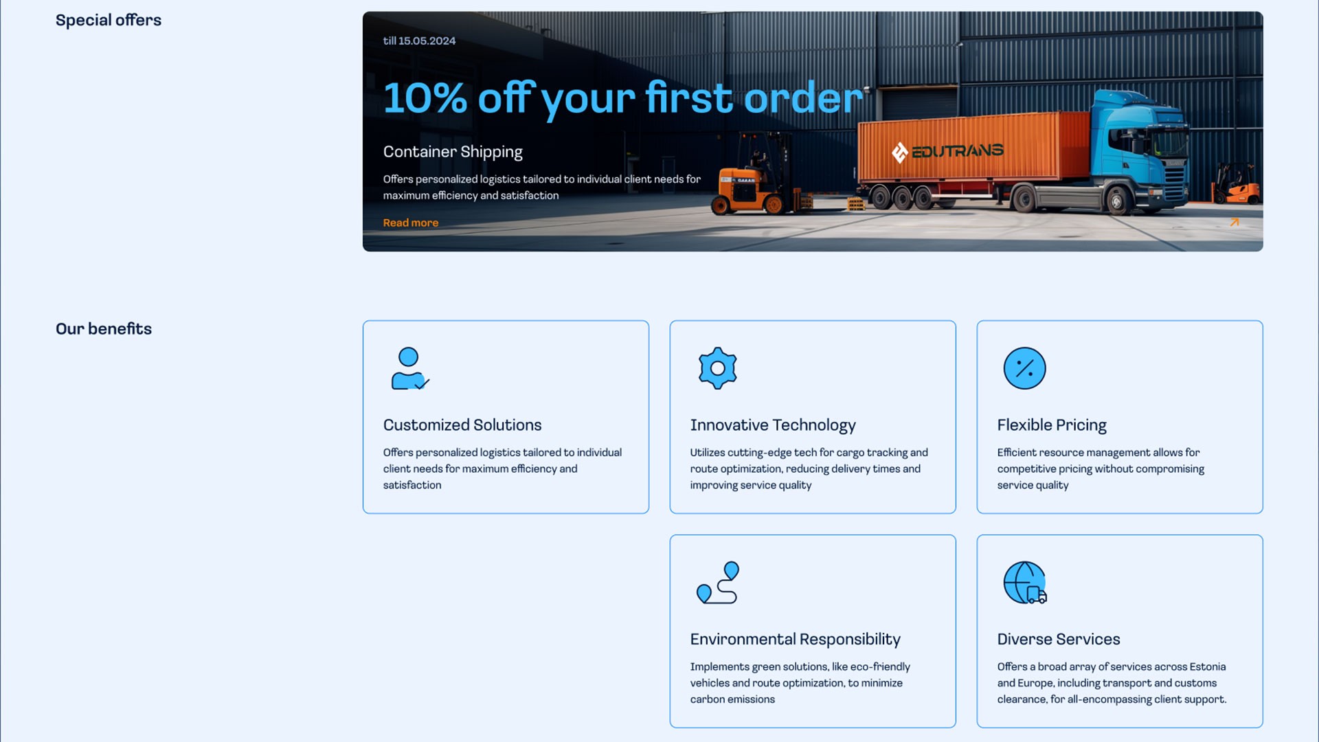
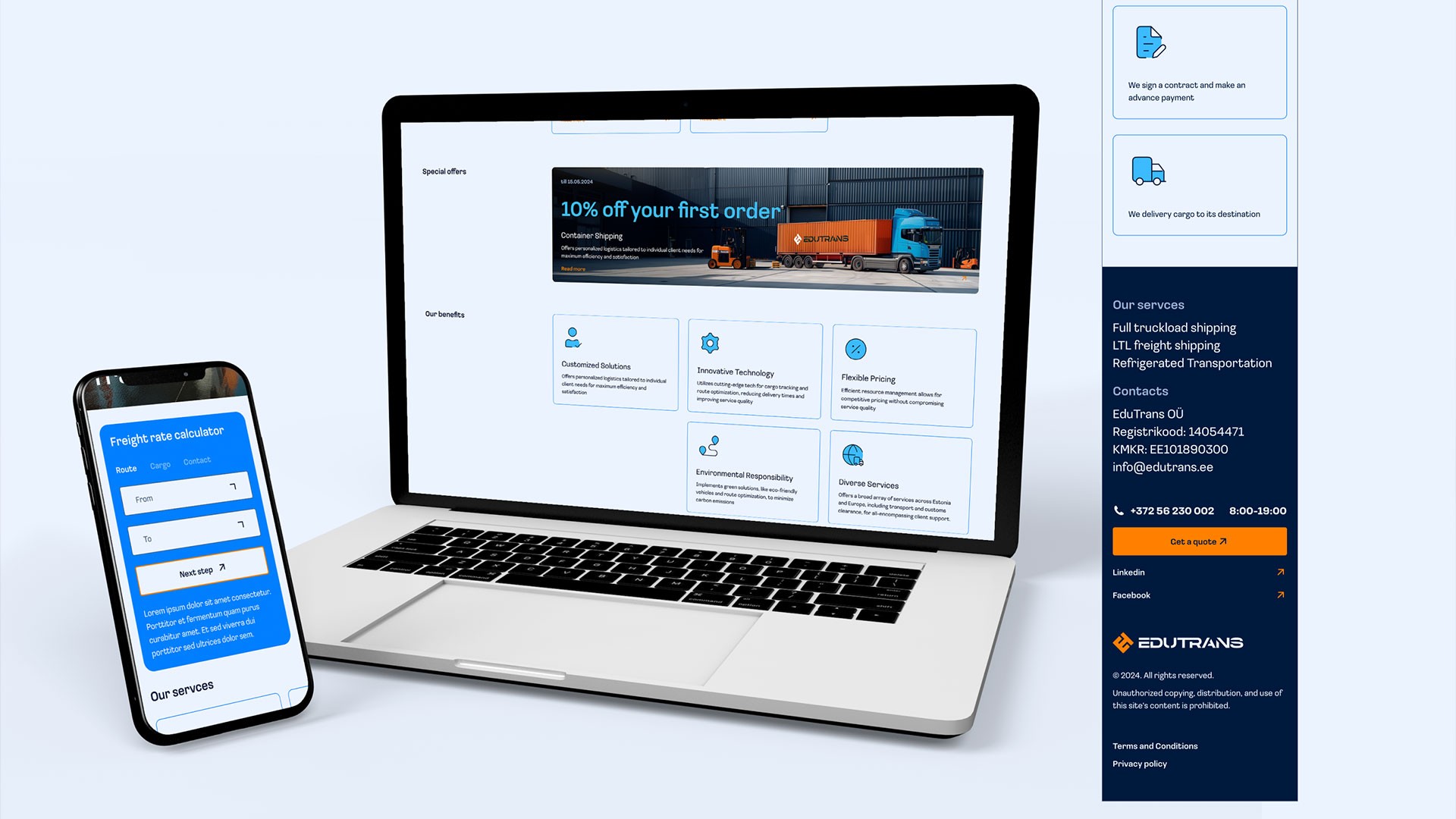
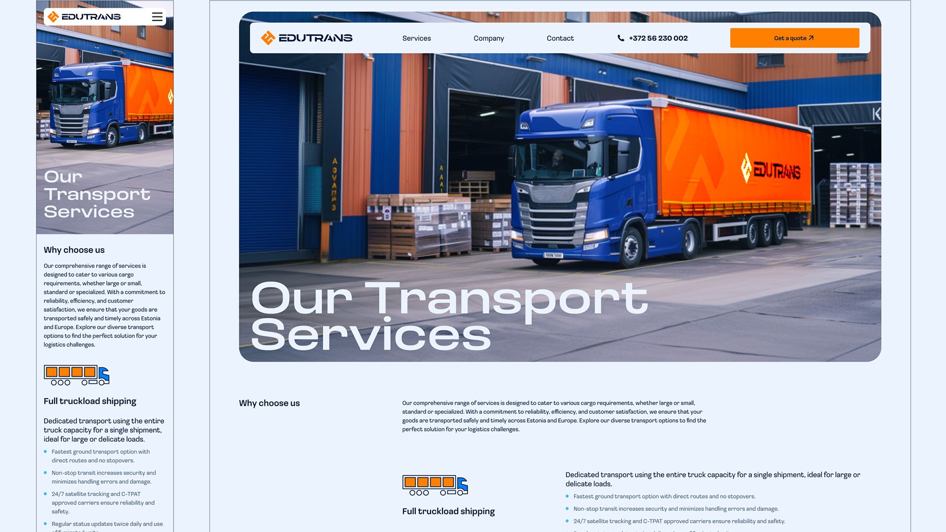
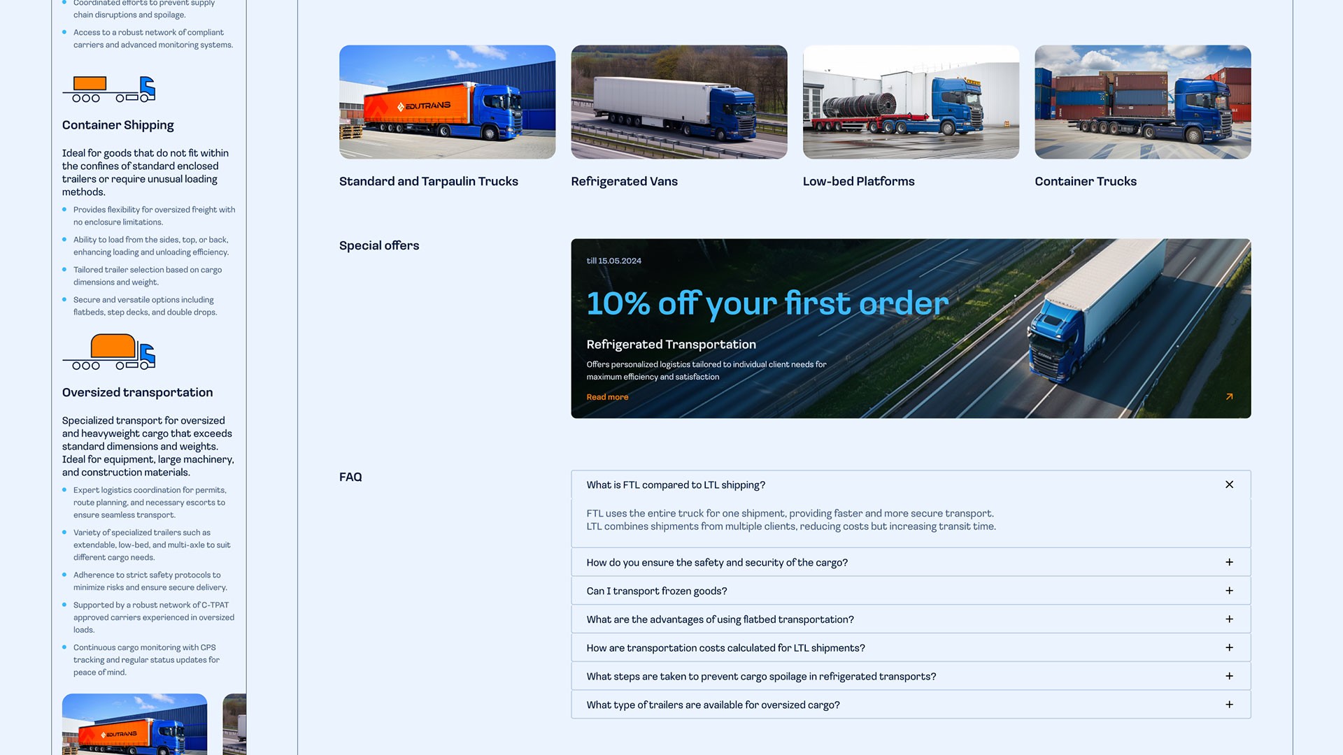
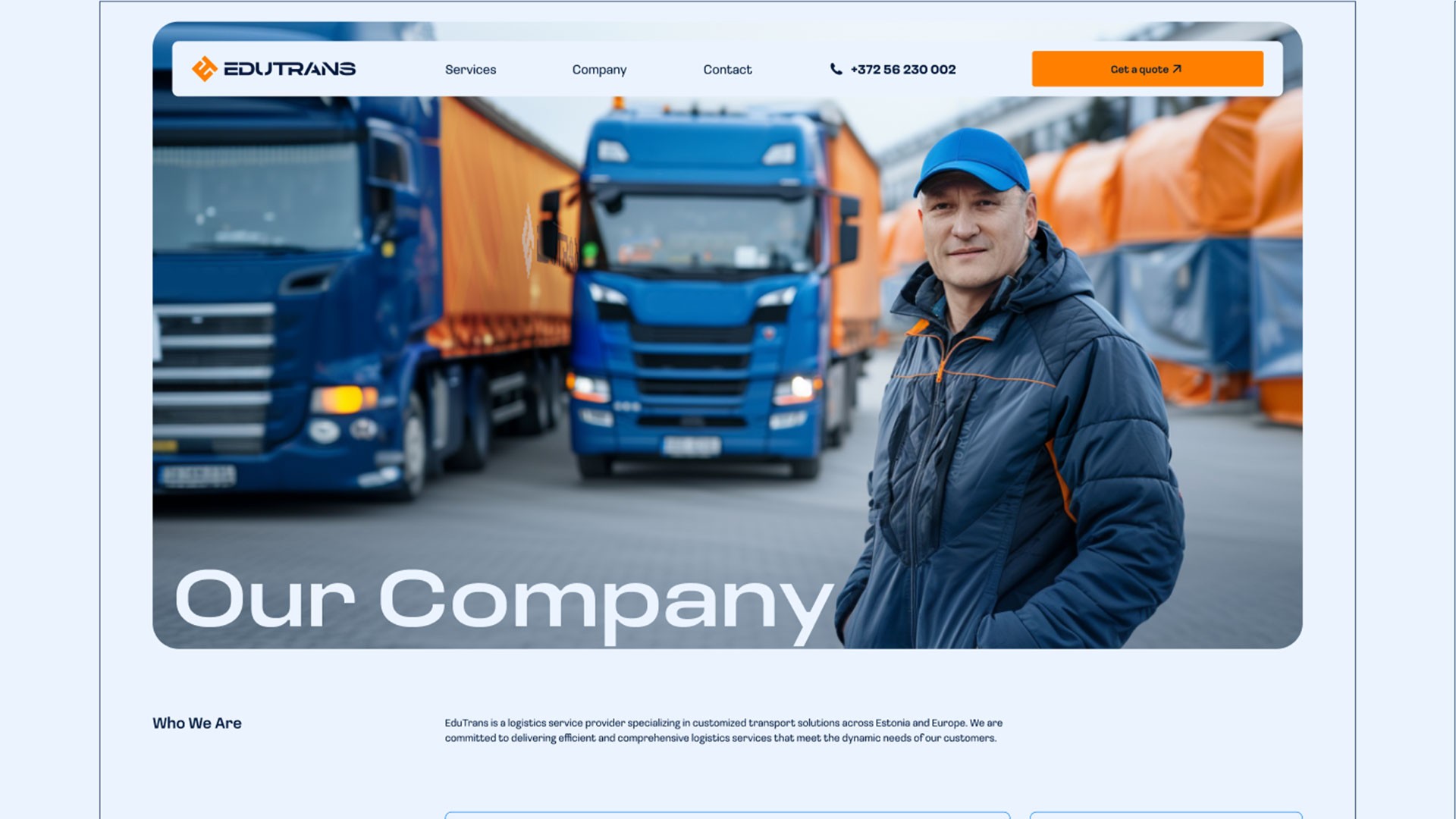
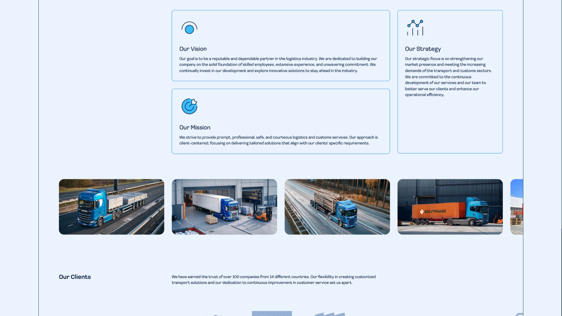
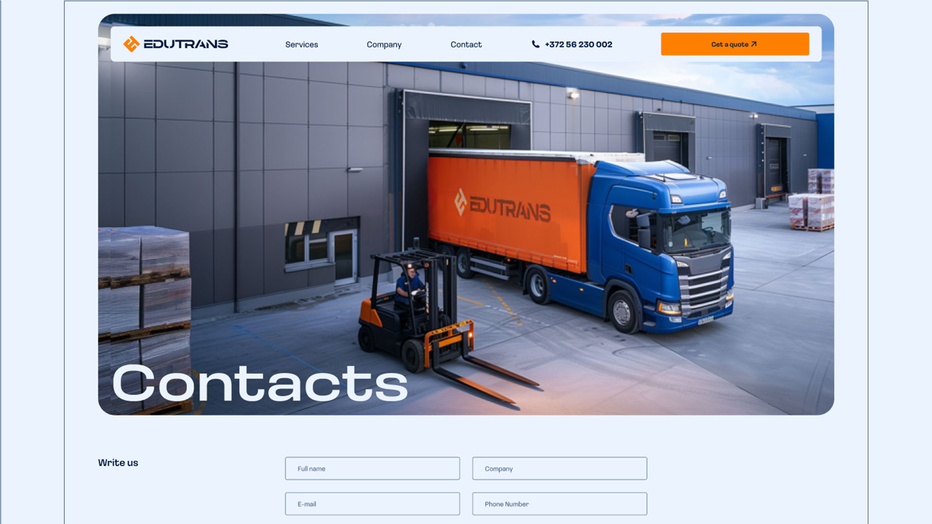
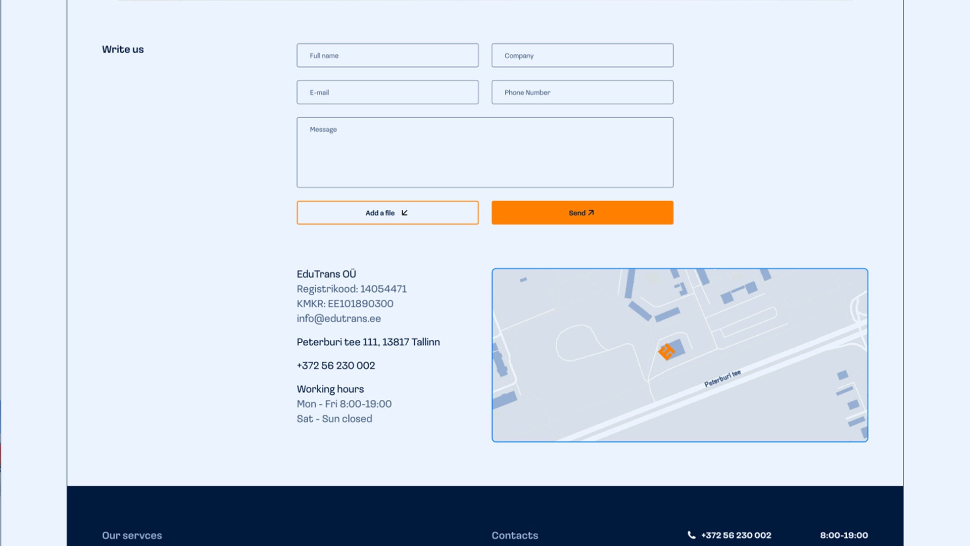
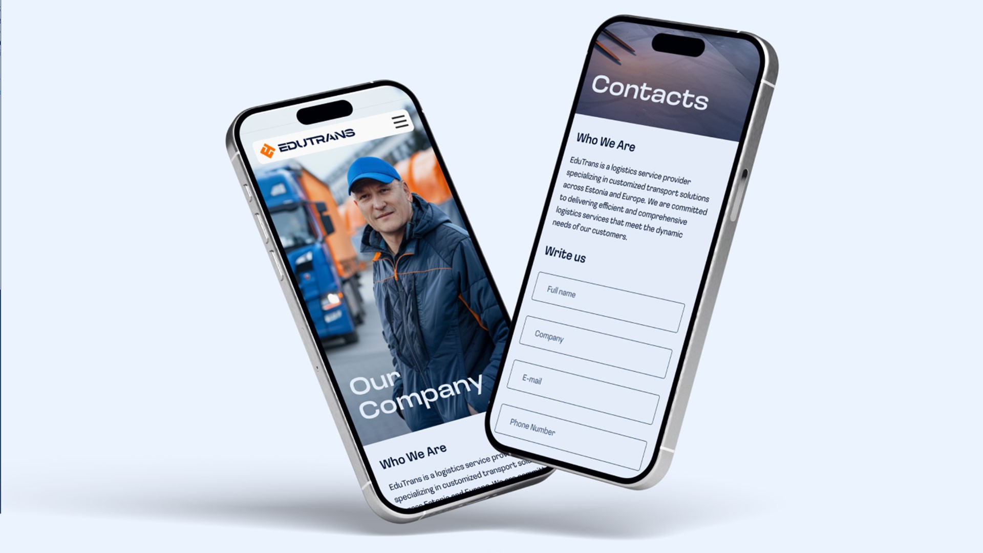
The website design was developed for user convenience and to reflect the brand's modern vision. A clean and logical menu with clear navigation was created in line with current web design trends, and the layout is optimized for mobile devices. The main sections include services, company information, contacts, and client solutions.


























get in touch
Interested in collaborating? I’m eager to connect with you. Reach out and let’s get started!
get in touch
Interested in collaborating? I’m eager to connect with you. Reach out and let’s get started!

EDUTRANS
Branding

Web and Marketing Design

Graphic Design
About
EduTrans is a logistics company based in Estonia that provides customized freight solutions across Europe. Its primary focus is on efficiency, reliability, and customer satisfaction. It offers full truckload (FTL), less-than-truckload (LTL), and specialized cargo transport services.

Task
Create a modern and fresh brand identity that reflects the values of efficiency, reliability, and customer satisfaction. Additionally, develop a website that embodies these values and provides a user-friendly experience. The goal was to develop a cohesive visual style that could be applied across all media, distinguishing the company in the logistics market.

Preparation
The initial phase of the project involved analyzing the logistics industry, key competitors, and defining the core values of the EduTrans brand. During the analysis, it was identified that many competitors relied on conservative branding approaches, with minimal emphasis on innovation, environmental responsibility, or a personalized client experience.

As a result, it was decided to focus on creating a bright, modern, and memorable brand that highlights innovation, sustainability, a personalized approach, and client convenience. This approach was intended to help the brand stand out in the market and appeal to clients seeking progressive logistics solutions. These elements formed the foundation of the project's vision and determined the visual codes that would emphasize its advantages.

Logo
The logo represents a modern and minimalist design, combining a symbol related to transportation routes and the company name. The design features a geometric approach, simplicity, and readability.


Color Palette
A vibrant and contrasting color palette was developed to highlight the brand's reliability and energy.

Typography
The typeface chosen is modern and easy to read, with a focus on simplicity and a premium look. The main typeface is Loos, a modern closed sans serif that pairs well with the color palette, providing a professional and cohesive appearance to all brand assets.

Identity
The identity includes the development of business cards, paper folders, brochures, envelopes, other office materials, as well as vehicle designs, driver uniforms, and merchandise, all executed in a consistent style. Each element undergoes strict quality control to ensure a unified visual style.


Social Media and Outdoor
To promote the brand, mockups were created for social media, highlighting brand messages, unique offers, and supporting sales. Visually, they emphasize EduTrans' achievements, brand attributes, and visual consistency


Website
The website design was developed for user convenience and to reflect the brand's modern vision. A clean and logical menu with clear navigation was created in line with current web design trends, and the layout is optimized for mobile devices. The main sections include services, company information, contacts, and client solutions.


get in touch
Interested in collaborating? I’m eager to connect with you. Reach out and let’s get started!